Here
are some of the graphics I made when I took the
PSP (Paint Shop Pro) courses at Web
Tech University.
![]()
|
|
|
|
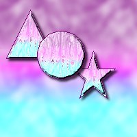
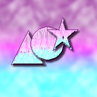
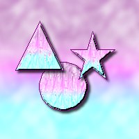
| Layers 1 - Shapes just placed and overlapping one another. Each shape is on a different layer | Layers 2 - The shapes were moved around and arranged differently. | Layers3 - Arranged yet a different way. With layers, it is easy to move things around and delete them if need be without interfering with the other objects! |
 |
 |
| This graphic shows the objects before the image was made transparent. |
This image shows the objects after the graphic was made transparent. |
 |
This is the picture rotated towards the left. |
 This
is the picture upside down. This
is the picture upside down. |
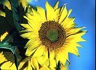
This is the picture rotated 270 degrees! |
 |
 |
 |
|
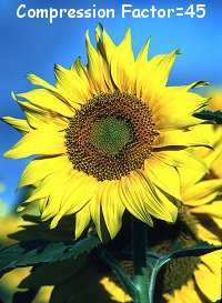
When you compress Jpeg pictures, the filesize goes
down, but the image quality also goes down. |
||
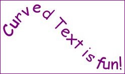
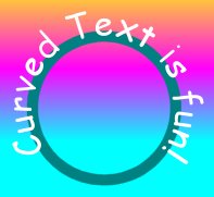
It was fun playing with curved text. PSP 6 started in with
vectors,
which is what you need to make curved text!
 |
These two graphics were made using the fill tool with a pattern!
 |
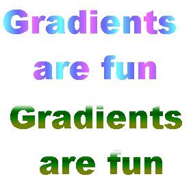 |
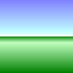
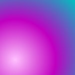
Gradients are cool and you can get many different effects from them.
|
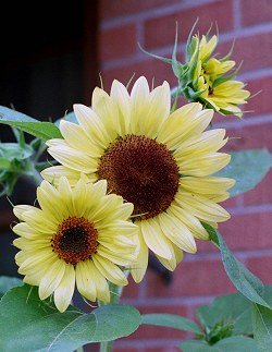
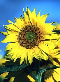
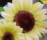
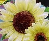
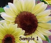
The big image is the original picture of sunflowers outside my house from the summer of 1999. From left to right, below: L. 1st cropped image M. Mirror image R. Image with added text. |
||
 |
 |
 |
 |
 |
 |
 |
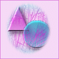
Selection made with feathering, then
inverted. Then click delete button and your
background color shows. It works neat for making border background tiles.
We also had to make a simple background set. You can see mine here!
I also made the background set for this
page. In the border tile, you can see that some
layers can be made less opaque, so that you can see through them. That is
something else
I learned while taking these two courses.
![]()
![]()
[ Site Index | Holiday Index | Contact Me | Home ]
Last updated on August 19, 2006 5:00 PM
© 1997-2006
